How to Catch Every Edge Case Before Your Users Do When Vibe Coding

Your vibe-coded app works perfectly. Right up until a real user touches it. Someone uploads a file that is far too large, gives the app the wrong type of input, clicks a broken link and lands on a blank 404, or runs into a request that fails halfway through. A page that looked perfect on a laptop suddenly breaks on an iPad. None of these moments appeared while building the app, because everything was tested on the happy path.
This is where Floot's Examples mode becomes useful. Instead of waiting for real users to discover everything that could go wrong, Examples mode makes those situations visible while the app is still being built.
You don't need a new tool for this. Connect Floot to ChatGPT or Claude, type the prompts below into that chat, and the states show up in Examples mode in your Floot project.
What gets missed
Current vibe-coding tools have made the happy path incredibly fast to build. Describe a page and it appears. Add a form, chart, upload component, animation, or new flow, and progress becomes visible immediately.
But your vibe-coded products are used in real-world situations, which means users will often behave in ways you never expected.
Maya is building an analytics product in Floot. One part of it lets users upload data and get useful insights back. In the ideal version of the experience, everything is straightforward: the user provides the data, waits for it to process, and gets the result.
Real usage is messier. A request fails. Someone uploads the wrong file format to the dashboard, follows an outdated link, or opens the product on a screen size you did not design for. All of these situations are part of the real product experience, but with most vibe-coding tools, they are surprisingly difficult to reproduce deliberately during development.
Testing an oversized file state means finding an oversized file. Seeing an empty state requires creating the exact conditions that make the page empty. A failed request needs to be deliberately broken. Because these situations take extra effort to trigger, they are easy to overlook until a user encounters them first.
Floot's Live and Examples toggle lets you switch, while you're vibe coding an app, between the live product and its example states, so you see both what the real product looks like and how those hidden edge cases might appear.
Instead of waiting for those problems to show up in real usage, you bring them into the development environment and work through them upfront.
Using Examples mode in 3 steps
-
Turn it on. There are two simple ways to create Examples in Floot.
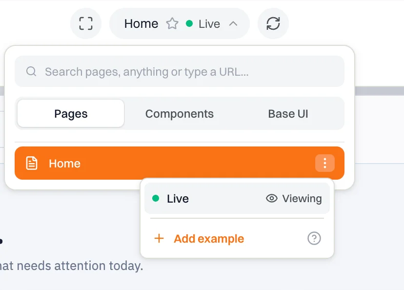
Option 1: Create an Example from the Pages menu
- Click Pages at the top of your Floot project.
- Find the page you want to create an Example for and click the three dots (⋮) next to it.
- Click Add example.
- Floot automatically copies a prompt for you. Paste it into ChatGPT or Claude connected to your Floot project.
Option 2: Ask your AI directly
You can also skip the menu entirely and ask ChatGPT or Claude to create Examples for you:
Create examples for the Home page.

Your AI creates the Examples in your Floot project, where you can switch between Live and Examples to inspect the different states.
-

Find your states. The sidebar lists every screen and state your AI has created.
-
Tweak one. Click the edit button on any screen card, or ask your AI to change it.
Make hidden states visible
Everyone accesses the same product, but they do not use it under exactly the same conditions you do while building it.
In Maya's example, users upload data to the product. Some have a fast connection and barely notice the wait, while others may sit there for several seconds. In that moment, the experience feels completely different. Does the page clearly show that something is happening, or does it look frozen? What if there is nothing to display, or the page fails to load altogether?
The difficult part is that these states stay invisible when the product is used as expected.
Instead of trying to recreate them one by one, ask your AI to surface them for you.
Show me the different states this page could have when real users are using it.
Your AI then turns those possibilities into separate screens inside Examples mode, such as loading, loaded, empty, or failed states. You do not need to know every possibility in advance. Your AI surfaces them, including situations you may not have thought about yourself.
Once those hidden states become visible, you can inspect them side by side and improve the user experience while you are still building the product.

What happens when users do the unexpected
In Maya's analytics dashboard, the happy path is simple. A user uploads a CSV successfully and previews the data.
But a file upload involves more than the successful state. A user might upload a 1 GB file when the dashboard only accepts 5 MB. They might upload the wrong file type. The upload might take too long, get stuck, or fail completely.
For someone without a technical background, these are easy scenarios to miss. Maya knows what she wants the feature to do when everything works, but she does not necessarily know all the ways it can break, or which states she should be designing for.
In ChatGPT or Claude, connected to her Floot project, Maya immediately sees what happens when a user uploads an oversized file.
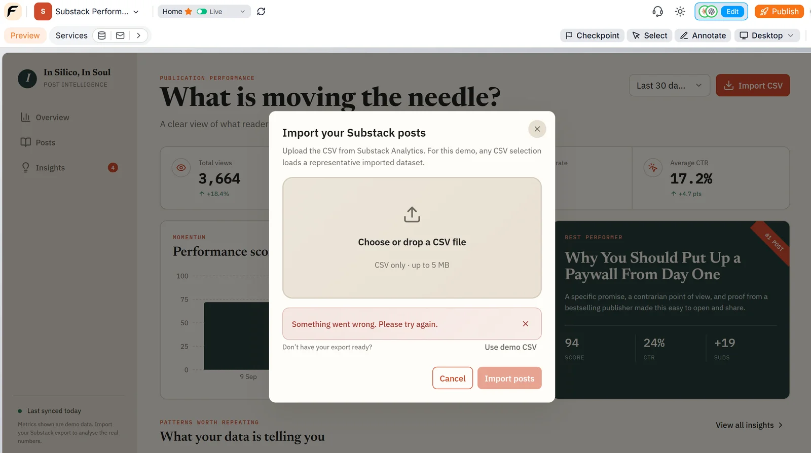
Before: the oversized-file error
Maya then gives ChatGPT or Claude another simple prompt:
Make this error clearer. Tell users the maximum file size and what they can do next.
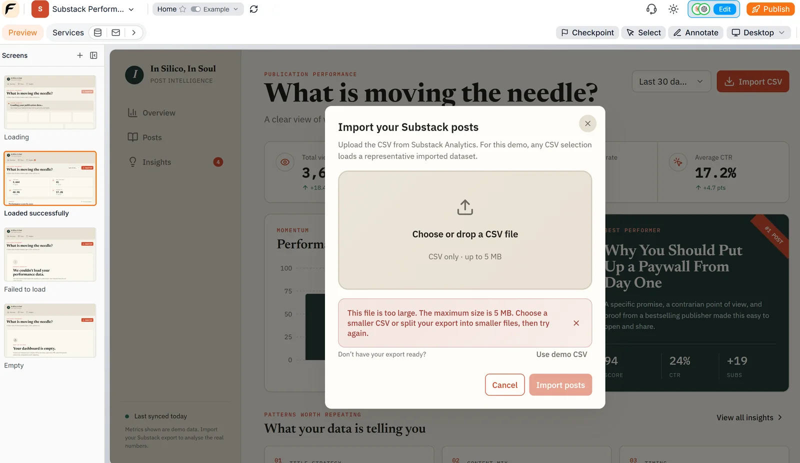
After: the error names the limit and what to do next
Once these states are visible, they become much easier to improve. A vague error message can be made more specific, and a failed upload can give users a clear explanation of what went wrong and what to do next, instead of leaving them staring at a blank page.
Instead of designing only the happy path, Maya can account for the states around it while she is still building the product.
Keep the product visually consistent
As a product grows, small visual differences can quietly creep in. A button added today might not quite match one created earlier. Spacing shifts between pages, forms start to look slightly different, and error messages may use different styles.
Instead of checking every page one by one, ask your AI to bring the visual pieces of your product together.
Show me the design system already being used across this product.
Your AI pulls together the colors, typography, spacing, buttons, forms, component states, and other UI patterns already in the project, all in one place.
Once everything is laid out side by side, inconsistencies become much easier to spot.

See the whole journey, not just individual screens
Looking at screens one by one can reveal local problems, but it does not show what happens between them.
The ideal user journey is simple: someone enters the product, provides information, waits for it to process, and gets a result. In reality, something may fail along the way. The user might retry, hit an empty state, follow a broken link, recover, and continue.
Those moments are much harder to understand when each screen is viewed in isolation.
Ask your AI to map the whole journey for you:
Create a simple user journey diagram for this Floot project.
It turns the flow into a visual diagram, so you can see how users move through the product and where things may go wrong along the way.

The same error looks different on another screen
Not every edge case is caused by a failed request or an unexpected input. Sometimes the problem only appears when someone opens your product on a different device.
Maya has already created Examples for her dashboard's loading, empty, and failed states. Everything looks fine on her laptop. But what happens when someone opens those same states on an iPad or a mobile phone?
An error message might get cut off. Two cards might overlap. The state itself works, but the user experience breaks.
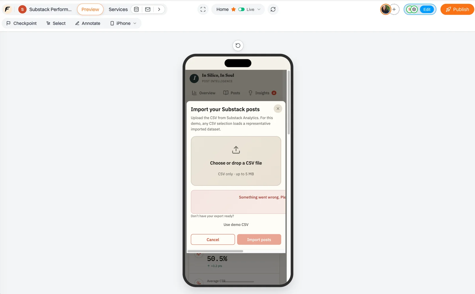
Before: the error state on a phone
Maya gives her AI a simple prompt:
Make all pages and their different states responsive across mobile, tablet, laptop, and desktop.
She then inspects those Examples at different screen sizes and catches layout problems that were invisible on her laptop.
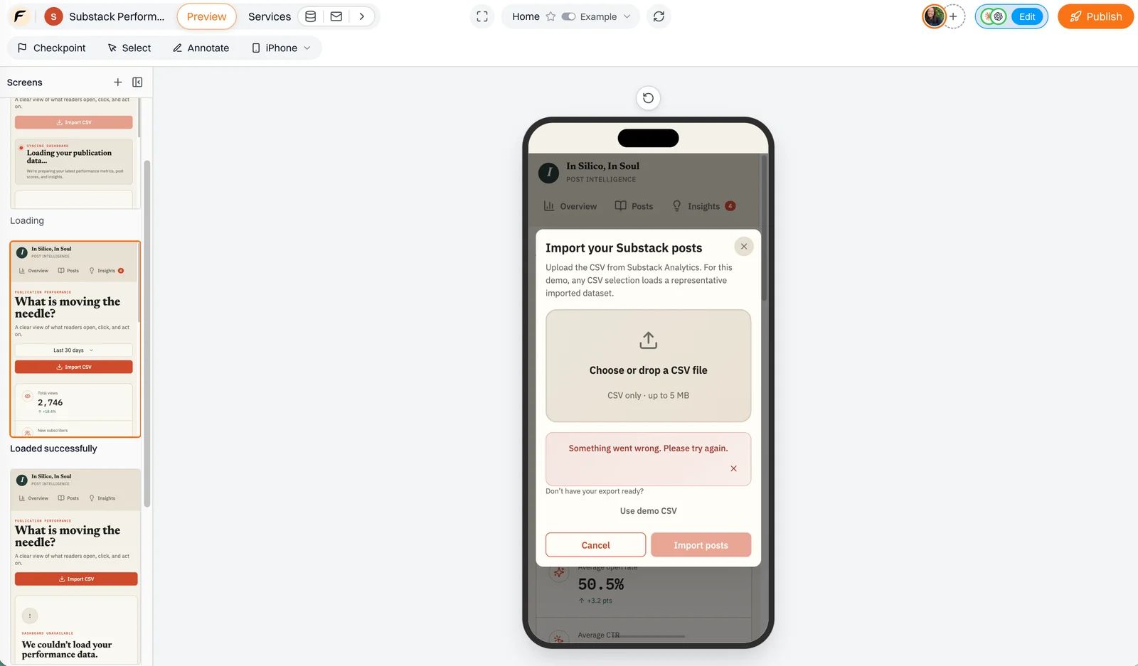
After: the same state, fixed for small screens
An error state that looks fine on one screen might not look right on another.
Make problems easier to review together
Edge cases are hard to review when the other person first has to recreate them.
"Upload a really large file." "Try the wrong format." "Can you somehow make the request fail?" "Open this on an iPad and look at the second card."
That is a lot of effort just to get two people looking at the same problem.
Once these situations exist as Examples, the problem itself becomes shareable. Someone reviewing the product can open the same loading state, failed upload, empty screen, or user journey without trying to reproduce the exact conditions first.
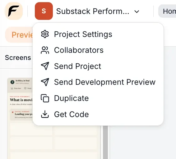
Add someone as a collaborator when they need to work on the project, or use Send Development Preview when they only need to look at the product and give feedback.
The conversation becomes much simpler because everyone is looking at the same thing.
"It works" is only the happy path
At the end of all this, your product still performs the same job it did before. What changed is everything around that happy path.
The waiting state is visible. So is the empty state. The wrong input can be inspected before anyone uploads it for real. Failed requests, broken links, retries, inconsistent components, and layouts that fall apart on different screens no longer have to stay hidden until launch.
Vibe coding has made it remarkably fast to reach the moment when an app works. But real users do not use it under the same conditions you did while building it, and that is often where unexpected problems appear.
Users also do not care how quickly the app was built, but they will remember being left staring at a blank loading screen with no idea what is happening.
The edge cases were always part of the user experience. Floot's Examples mode makes them visible in the development environment before users have to experience them in the real world.
Xian Li
Xian Li is a first-time founder building in public and the writer of In Silico, In Soul, a newsletter about the mistakes, lessons and breakthroughs that come with creating a product from scratch.