Design, Build and Refine Your App with Floot Design Canvas

Matthew has designed a smart trekking pole. Now he faces a new challenge. How can he turn his physical invention into an online shopping experience people actually want to use?
He has five different models to sell, and he wants an online store that clearly shows customers the differences between them while highlighting the strengths of his product. Although Matthew has no formal design background, he wants his online store to have a distinctive visual identity that highlights the unique features of his products.
This is where Floot's newly launched Design Canvas feature comes in. Matthew can simply ask his assistant to create a brand new Design Canvas for any page or UI element. Floot then presents different design options side by side, making it easy to compare ideas, explore different directions, and choose what works best. Instead of starting from a blank page, Matthew can see the possibilities right in front of him.
In today's tutorial, we'll follow Matthew through two rounds of building.
In the first round, he uses Floot Design Canvas to explore six completely different visual directions before choosing one for his store. He then builds the website, uses Design Canvas again to refine the typography, updates the hero image, and takes advantage of Floot Examples to make sure the homepage handles different states and edge cases.
In the second round, customer feedback inspires a new Find my pole feature that helps shoppers find the trekking pole best suited to their needs. Matthew returns to Design Canvas to explore the entire customer journey, including two different ways to receive personalised product recommendations. Once he's happy with the experience, he implements the design using the store's existing product database. He also explores potential database enhancements for future recommendation features, without changing the current schema.
Throughout the process, Matthew uses Floot Design Canvas to compare visual directions, refine typography, and create a smoother shopping experience. Floot also brings design, development, database management and deployment into one workflow, helping him turn his ideas into a working store and improve it as his needs evolve.
You'll learn how to:
- Compare radically different interfaces before committing to a design.
- Explore typography without redesigning the entire website.
- Use Select for small, targeted UI fixes.
- Turn a design canvas flow into a working feature with two customer journeys.
- Use Floot Examples mode to check loading, successful and error states.
- Explain how new frontend experiences connect to existing backend data and when a database change would actually be needed.
Before you begin: connect Floot to ChatGPT or Claude
Before creating your first design, connect Floot to your preferred AI assistant. Floot works with both ChatGPT and Claude, allowing you to create and refine applications directly through your conversations.
If you're using ChatGPT:
- Open the Floot app in ChatGPT's app directory and click Install.
- Sign in to your Floot account when prompted to authorise the connection.
- Start a new ChatGPT conversation and select Floot from the + menu, or type @Floot in your message.
If you're using Claude:
- Open Floot in Claude's connector directory and click Connect.
- Sign in to your Floot account to authorise the connection.
- Start a conversation in Claude and mention Floot in your request so Claude knows to use the connector.
Once connected, you can describe the app you want to create, explore designs in Floot Design Canvas, and ask your assistant to implement and refine your chosen direction.
With the connection ready, Matthew can begin exploring six visual directions for his smart trekking pole store.
Round one: design and launch the original store
1. Start with six completely different directions
Matthew could ask Floot to build a homepage immediately. Instead, he starts with Design Canvas, where he can compare multiple visual approaches before choosing one.
Ask your assistant:
I want to build a smart trekking pole e-commerce store. Please use the Floot canvas to show me a few options first so I can explore how it might work.

Make sure the six UI directions are completely different in style, so I can compare clearly different approaches before deciding which one to build.
Here, Matthew asks his assistant to generate six different UI directions, but you can actually ask your assistant to explore as many options as you want.
What makes Floot Design Canvas so useful is that all the options are presented right in front of you. You can easily compare them side by side, see what you like or dislike about each design, and decide which direction works best for your product.
This saves a lot of back-and-forth communication with your assistant. Instead of repeatedly describing what you want and waiting for another design, you can explore multiple possibilities visually and make decisions much faster.
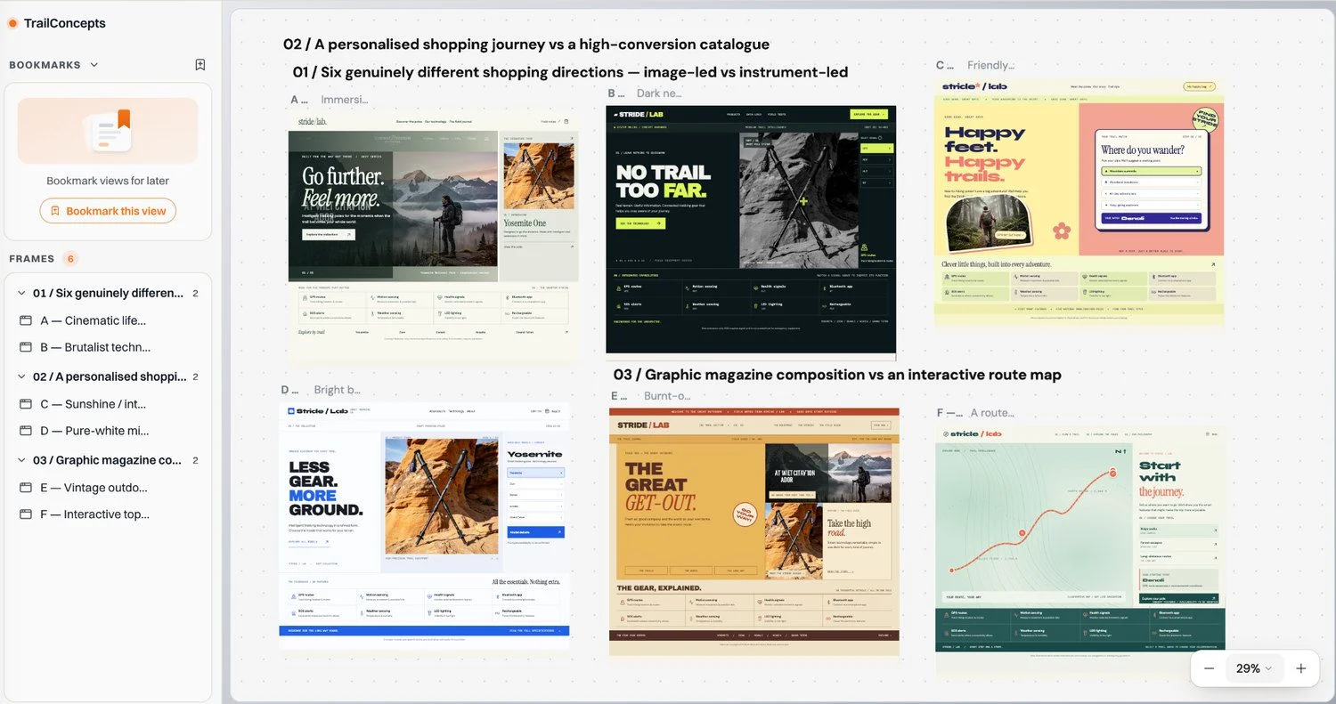
Figure 1 Six contrasting art directions presented on one canvas, so Matthew can compare layout, tone and hierarchy before building.
Why this step matters: “Make it look good” is hard to evaluate. “Compare these six directions and choose the best fit for a technical trekking product” is much easier. Matthew chooses Option B, the dark, equipment-led direction with a vivid lime accent.
2. Build the store using the chosen direction
With the visual identity decided, Matthew asks his assistant to apply it consistently across the complete store, not just the homepage.
Ask your assistant:
I prefer Design Option B. Please apply its design style to build the complete Stride / Lab smart trekking pole e-commerce store.

Keep Option B's visual identity consistent across the entire website, including the homepage, product listings, product detail pages, shopping cart, and checkout.

On the homepage, prominently showcase these smart features: GPS tracking, motion sensors, health monitoring, Bluetooth connectivity, SOS function, environmental sensors, LED lighting, and rechargeable battery.

Make sure the store is fully responsive, visually polished, and provides a smooth shopping experience. Stay faithful to Option B's original design direction.
The store has a coherent visual language: dark surfaces, precise dividers, technical labels, bright lime actions, and a striking product hero. The catalogue contains five models—Yosemite, Zion, Denali, Acadia and Grand Teton—with their own prices and product specifications.
But Matthew notices a problem. The layout is close to what he wants, yet the typography feels wrong. And changing fonts across a live interface by trial and error is a poor way to decide what works and it is very time consuming.
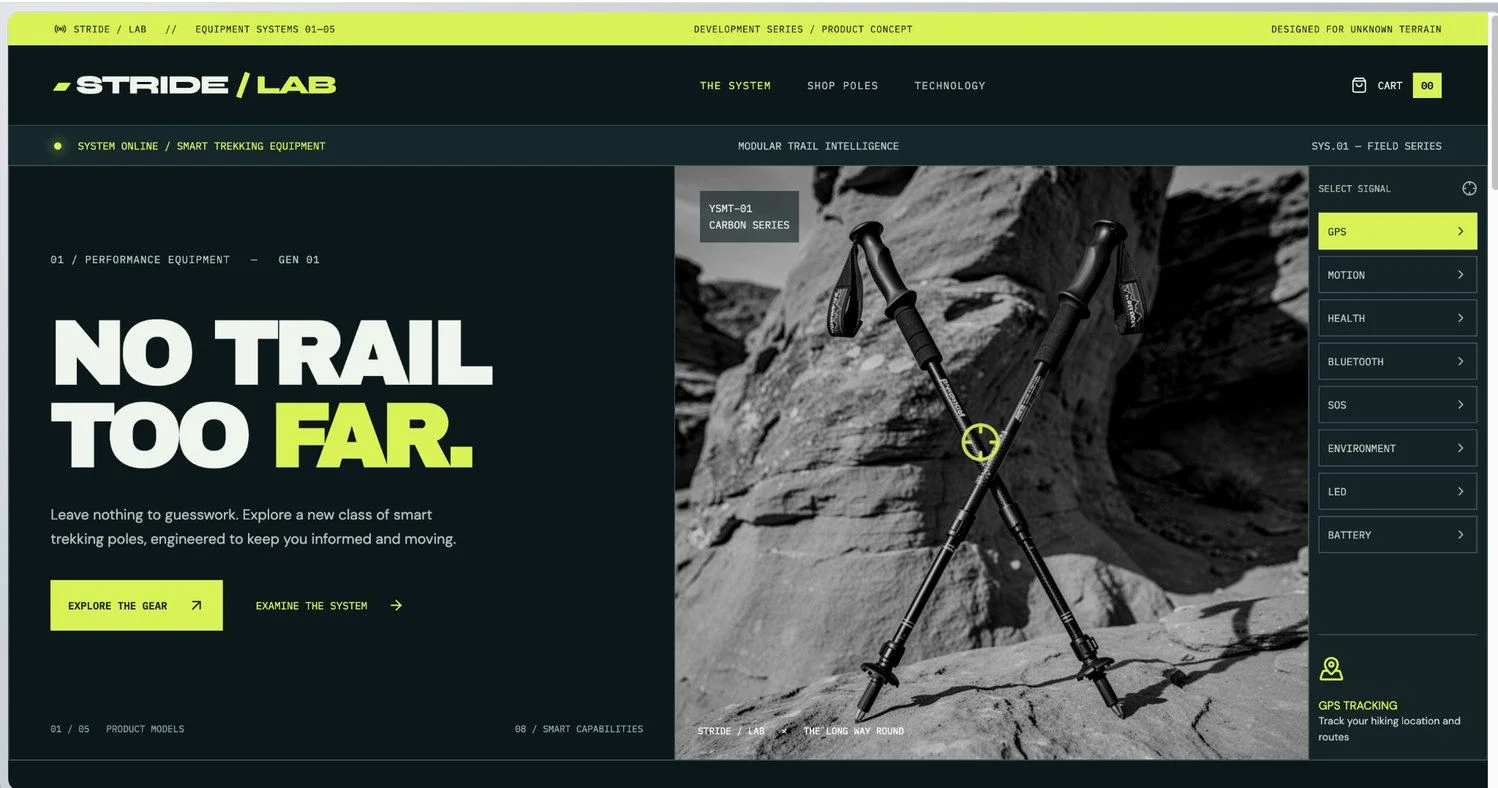
Figure 2 The initial store looks consistent with Option B, but the font still needs refinement.
3. Make a new Canvas just for typography
Rather than asking for an entirely new website, Matthew isolates one design variable: the font pairing in the hero.
In Floot, the New designs go to control determines where the assistant can place new designs. Choosing Any canvas allows the assistant to select an existing canvas or create a new one.
To keep his typography exploration separate from the original six design directions, Matthew creates a new Design Canvas.
Above the canvas, set New designs go to to Any canvas. This allows the assistant to create a new canvas when Matthew explicitly requests one in the prompt below. If This canvas is selected instead, asking for a new canvas will not override that setting.
Alternatively, you can manually create a new canvas and select This canvas to direct the assistant to work within it.
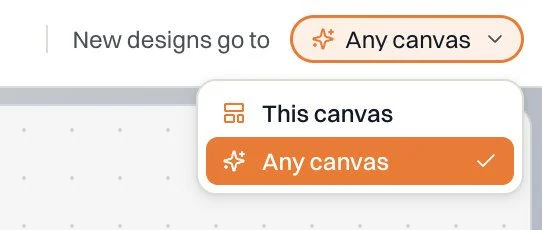
Figure 3 The New designs go to control allows the assistant to choose or create a canvas. Matthew explicitly requests a brand-new canvas for his typography exploration.
Ask your assistant:
Act as an expert typography designer and UI/UX art director.

Analyse my current website and focus only on the hero section.

Use Floot Design Canvas to create a brand-new canvas featuring six side-by-side design frames for easy visual comparison.

1. One frame showing my current hero section 2. Five new frames showing the exact same hero section with five different font pairings

Important:

Do not create new visual directions. Do not redesign the layout. Do not change colours, images, copy, spacing, or components. Only change the typography.

For each new frame:

Apply one heading font and one body font. Show both fonts directly in the actual hero UI. Label the frame with the font names and a score out of 10. Briefly explain why the pairing fits the website. Prioritise readability. Never use all caps. Use commercially available fonts.

Arrange all six frames clearly on the Design Canvas.

Recommend the strongest option, but do not apply it to the real website yet.
The six frames allow Matthew to compare different typography treatments within the same overall hero design. They retain a consistent visual direction, product image, colour palette and core interface elements, while exploring different font pairings, heading treatments and text arrangements.
Comparing these variations side by side helps Matthew evaluate which typography direction best suits his store before applying it to the website.
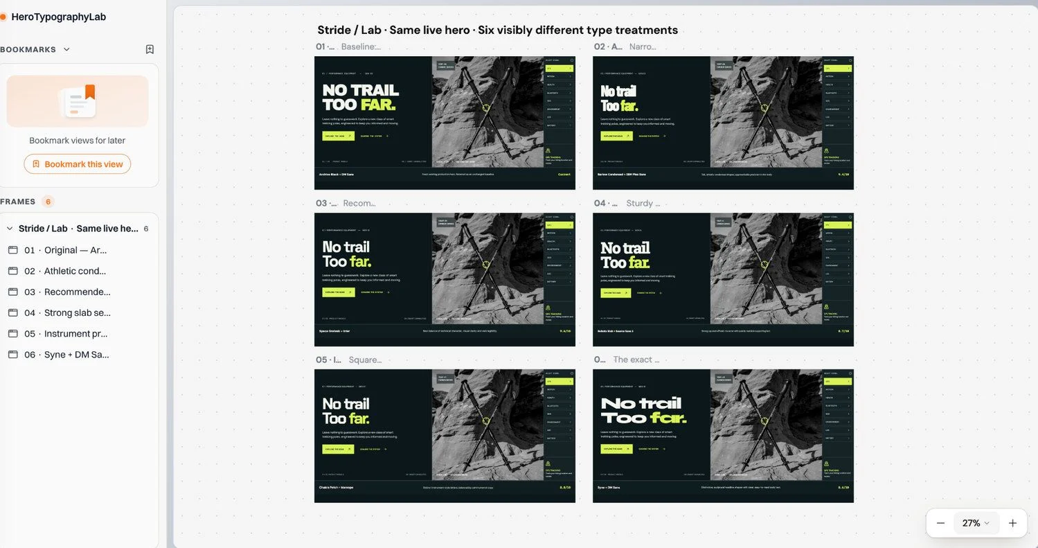
Figure 4 One baseline and five alternative typography treatments, presented within a consistent hero design to compare readability and visual character.
Matthew chooses Option 6 and asks his assistant to apply its typography treatment consistently across the entire store.
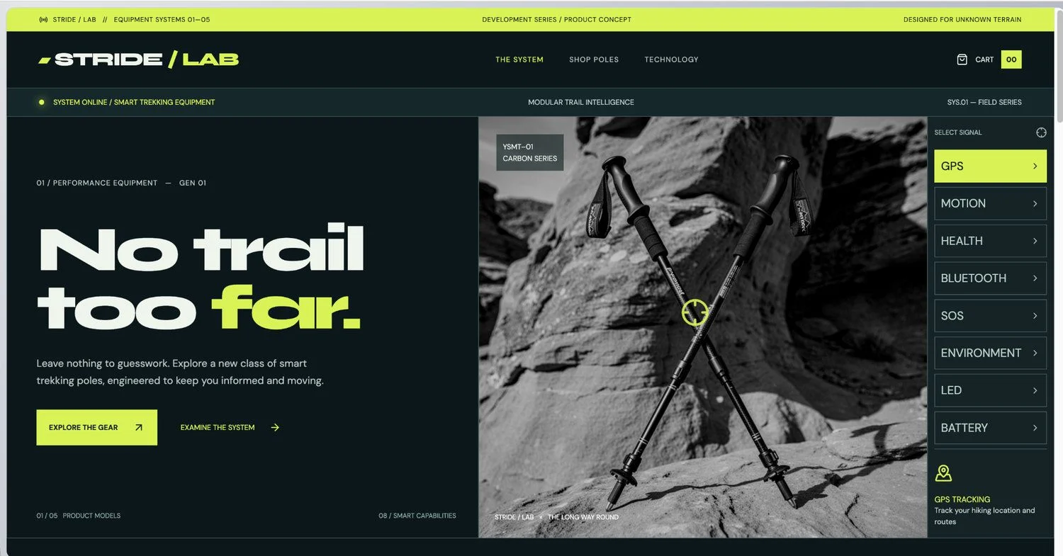
Figure 5 The selected font pairing has been applied consistently to the hero section and the rest of the store.
4. Fix two recurring AI design habits with precise selection
Once the overall typography is in place, Matthew spots two smaller but common readability issues.
Problem A: Too much all caps text.
All caps headings and entire blocks of UI text become tiring and hard to scan. Matthew prefers sentence case for navigation, descriptions, and the majority of controls. Sentence case also aligns more naturally with how people read, making text easier and more comfortable to follow.
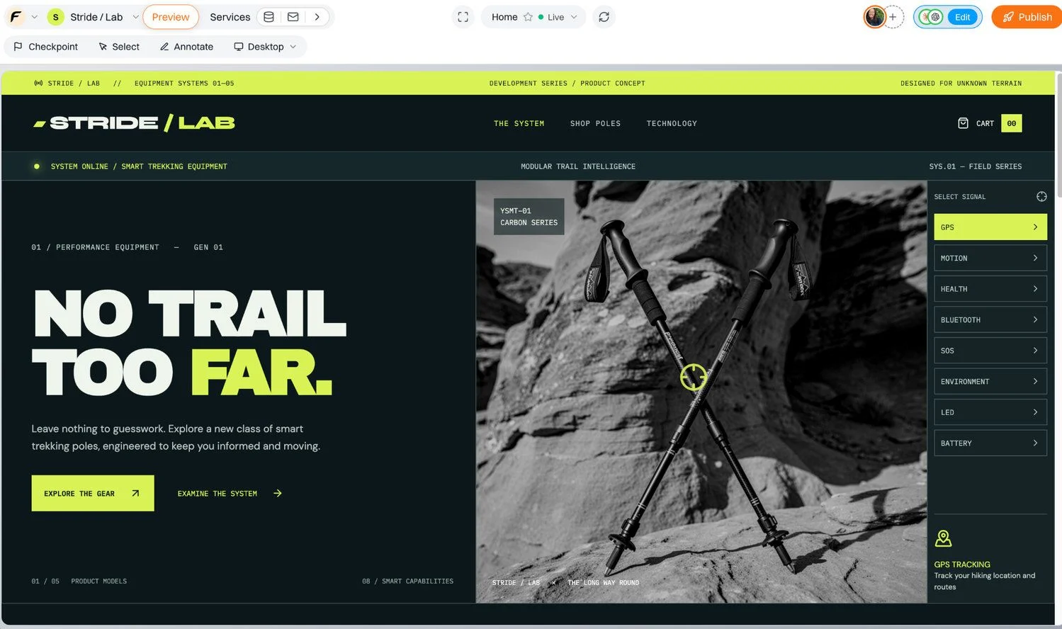
Figure 6 An example of overusing uppercase text in the technical product interface.
Problem B: Text is too small to read comfortably.
Another design problem is the use of font sizes that are too small, making text difficult to read on both desktop and mobile devices.
The lime-coloured text here is a good example. Although it looks stylish, the small font size reduces readability and makes it harder for the text to fulfil its primary purpose of communicating information clearly.
To improve readability, Matthew establishes his own typography guidelines for the store. He decides to use at least 16 px for main body text and 14 px for secondary text across desktop and mobile layouts.
Note: these sizes are Matthew's chosen design rules rather than universal accessibility requirements. Readability also depends on factors such as font characteristics, contrast, spacing and how well text responds to different screen sizes and user preferences.
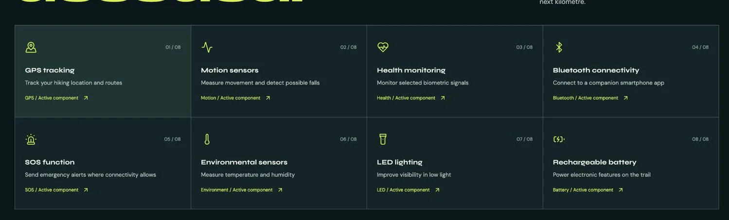
Figure 7 The second design issue: text that is too small to read comfortably.
This is where Floot's Select tool becomes useful. Matthew doesn't have to describe a vague region of the page in a long prompt. He selects the specific UI element in the preview and asks for a targeted refinement.
First, activate Select in the preview toolbar.
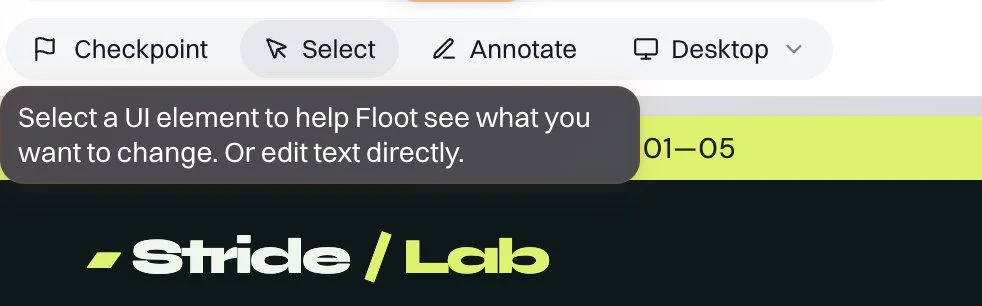
Figure 8 Select is the starting point for a small, targeted UI refinement.
Then click the element itself. Floot identifies the selected part of the live preview, which makes the instruction much more precise.
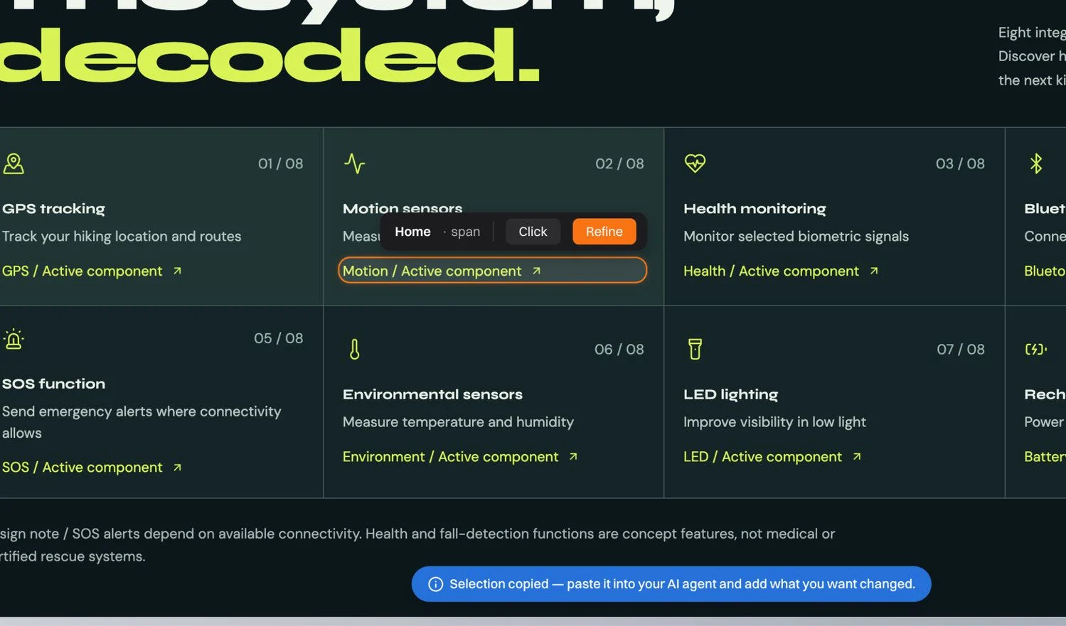
Figure 9 An additional targeted selection, rather than a broad page-level redesign.
Matthew wants to keep the interface clean and simple without making important actions difficult to access. On desktop, he decides to reveal additional action text when customers hover over a card or navigate to it using the keyboard.
For touchscreen users, the action remains visible so customers can access it without relying on hover. This preserves the cleaner desktop presentation while keeping the interaction usable across different devices and input methods.
So, he asks his assistant:
Make the selected text easier to read by using sentence case instead of all caps, keeping the font size at least 14 px, and improving the spacing where necessary.

On desktop, reveal the additional action text when a customer hovers over the card or navigates to it using keyboard focus.

On touchscreen devices, keep the action visible so customers can access it without hover.

Ensure that interactive actions can be reached and activated using a keyboard, have clear focus indicators, and remain accessible to assistive technologies.

Do not change any unrelated elements, colours, content, or behaviour.
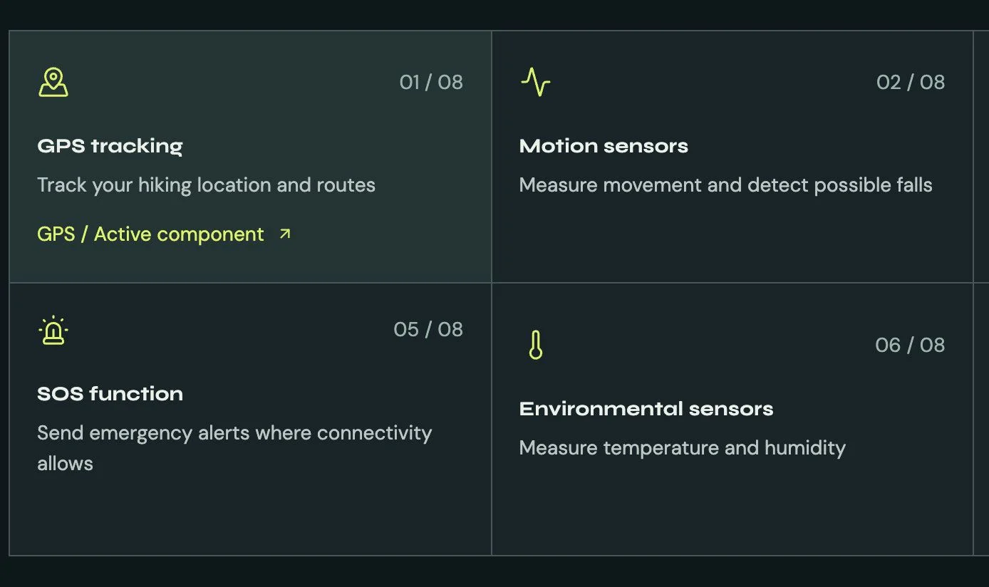
Figure 10 The refined card design uses larger, more readable text and shows the additional action on desktop hover. Keyboard focus and touchscreen access should provide equivalent functionality.
5. Replace the hero image without disturbing the rest of the page
Matthew also wants the homepage to show the product's smart capabilities more directly. He supplies a new annotated trekking pole image and asks Floot to replace the hero visual. The successful result keeps the established layout and messaging intact.
Ask your assistant:
Replace only the homepage hero image with the photo I've uploaded. Keep the existing layout, headline, buttons, colours, spacing and other page sections unchanged. Make sure any annotations already built into the image are not duplicated on top of it.
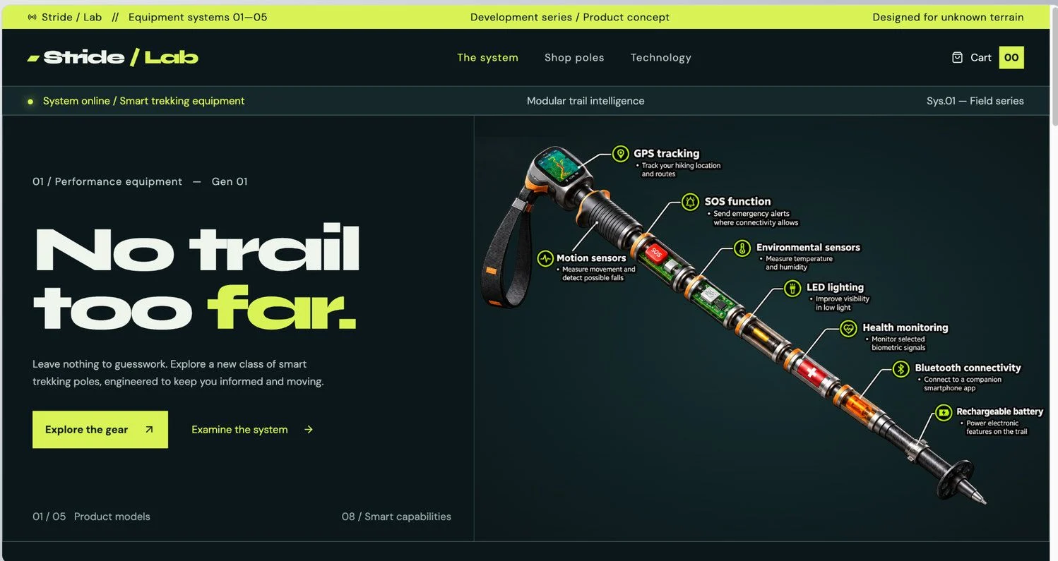
Figure 11 A more explanatory product image, incorporated without reopening the typography or layout decisions.
6. Test the homepage in Floot Examples
Floot has a handy feature called Examples, which lets you preview different UI states of a page, including loading, empty, success and error states, without having to trigger those situations in the real application.
Examples are available within the Floot editor and are not part of the published store. They display staged UI states and server responses, making it easier to review how different situations would look to customers.
Matthew uses Examples to explore how his homepage presents loading images, empty shopping bags and returning customer information. This helps him identify potential design issues before testing the actual functionality in the application.
However, reviewing an Example does not verify that real uploads, data processing, product recommendations or checkout functionality work correctly. Those behaviours need to be tested separately in the working application.
Ask your assistant:
Use Floot's Examples feature to show six different states of my current homepage:

1. Home page: All images fully loaded. 2. Loading: Images display soft, blurry placeholders. 3. Progressively loading one image: Reveal one hero image from blurry to sharp, from top to bottom in 1.5 seconds. Add a Replay loading button. 4. Successfully loaded: All images fully sharp. 5. New customer: First-time visitor with an empty shopping bag and no saved products or field-kit summary. 6. Returning customer: A visitor who added one product to their bag. Show a Your field kit section with the product, quantity, estimated subtotal, and a link to review the bag.

Keep the layout, colours, text and other design elements unchanged. Only change what is needed for each state. Make the screens clearly distinguishable and isolated so switching Examples does not change the real shopping bag.
To create the first Example, open the page picker in the Floot editor and locate the Home page. Click the three-dot menu beside the page and select Add example. Floot provides a ready-made prompt for your assistant. Depending on whether you're using ChatGPT or Claude, the prompt may appear directly in your chat or be copied for you to paste manually.
Once the Examples have been created, you can switch between them in the editor to inspect the staged states without affecting the published store.
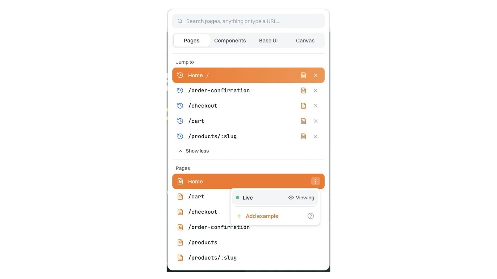
Figure 12 In the Floot editor's page picker, open the three-dot menu next to the Home page and select Add example. This option is available before the page has any Examples. Floot provides a default prompt, which may be copied or inserted into the assistant's chat depending on the client.
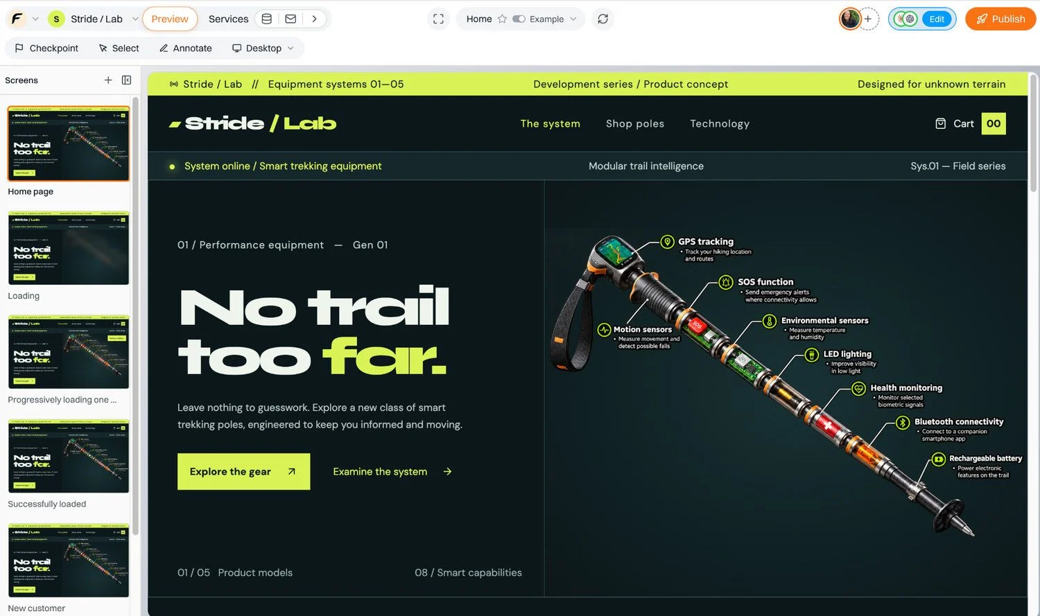
Figure 13 Floot Examples displays staged homepage states, including loading, successful loading, new customer and returning customer views, within the editor.
7. Add checkout and prepare for launch
Before launching the store, Matthew needs to set up checkout so customers can later purchase his trekking poles. Floot provides built-in Stripe integration, allowing him to add a payment flow without manually configuring payment APIs or writing integration code.
Matthew first tests the checkout experience in Floot's preview, which uses Stripe test mode. This allows him to explore the payment interface and simulate transactions without connecting his own Stripe account or moving real money.
To accept real payments, the store owner must connect their own Stripe account, complete the required setup, use an eligible paid Floot plan (Pro or Power), and publish the application. Only then can the published store process real customer payments.
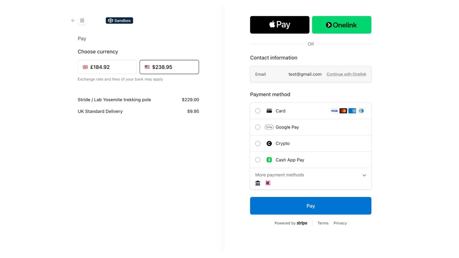
Figure 14 Store's Stripe checkout interface in Sandbox test mode, showing currency selection and available payment methods. Transactions in this preview environment are simulated and do not involve real money.
Round two: turn customer feedback into a better shopping journey
8. Let the feedback reshape the experience
After launching the store, Matthew starts collecting feedback from existing customers and visitors who are interested in buying. Many of them like the smart trekking poles, but some struggle to decide which model is right for them. The five product pages provide plenty of information, but customers still have to compare the models themselves.
The feature request sounds simple. “Help me find the right pole.” However, designing a smooth customer journey is not quite so straightforward. Should customers upload their hiking activity data to receive personalised recommendations? Would a short questionnaire be easier? And once they receive a recommendation, how can they smoothly continue to the product page and checkout? What should the user journey look like?
Instead of jumping straight into implementation, Matthew returns to Floot Design Canvas to explore the possible customer journeys and find the best approach before building the feature into his store.
Before sending the prompt, above the canvas, set New designs go to to Any canvas. This allows the assistant to create the brand-new canvas requested below. If This canvas is selected instead, the assistant will work within the current canvas, even if the prompt requests a new one.
Alternatively, you can manually create a new canvas and select This canvas to direct the assistant to work within it.
Ask your assistant:
Create a brand new Floot Design Canvas for the store to explore a personalised product recommendation experience.

Design a smooth customer journey with two tabs:

Upload Hiking Data: Customers upload a sample hiking data file, preview their data, and get product recommendations.

Quick Quiz: Customers answer three questions about their preferred terrain, typical hiking duration, and top priority (lightweight comfort, navigation and safety, or battery life).

Both paths should lead to a recommendation from our five existing trekking pole models, explaining why it's a good match, with options to view the product or add it to cart.

Explore the full journey, from entry point to recommendations and checkout. Make it easy to go back, change inputs, or switch methods.

Keep the design consistent with Stride / Lab's existing visual style, and prioritise a frictionless experience on desktop and mobile.

For now, focus only on exploring and refining the designs in Canvas. Don't implement anything or change the existing website yet.
9. Discover the entry point and two paths in Canvas
The most helpful design decision is surprisingly small: “Find my pole” becomes a fourth navigation item. Customers can enter the tool from the existing store without searching around for a hidden feature.
The Canvas explores two paths in parallel. One serves shoppers who already have hiking data. The other gives everyone else a faster option.
Path A: Upload hiking data. Select a CSV, see a preview of terrain, duration, distance and elevation gain, then request a match. A preview step gives customers confidence that the app understood their file.
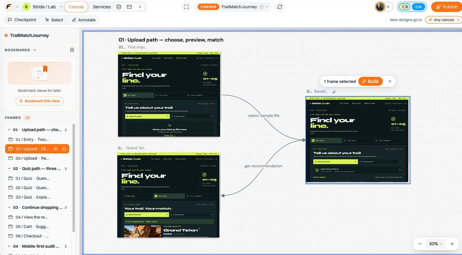
Figure 15 The upload route is sketched as a sequence: choose file, inspect hiking information and receive a product match.
Path B: Take a quick quiz. Answer three questions—terrain, typical hike length and what matters most: light weight, navigation and safety, or battery life. This path removes the friction of preparing a data file.
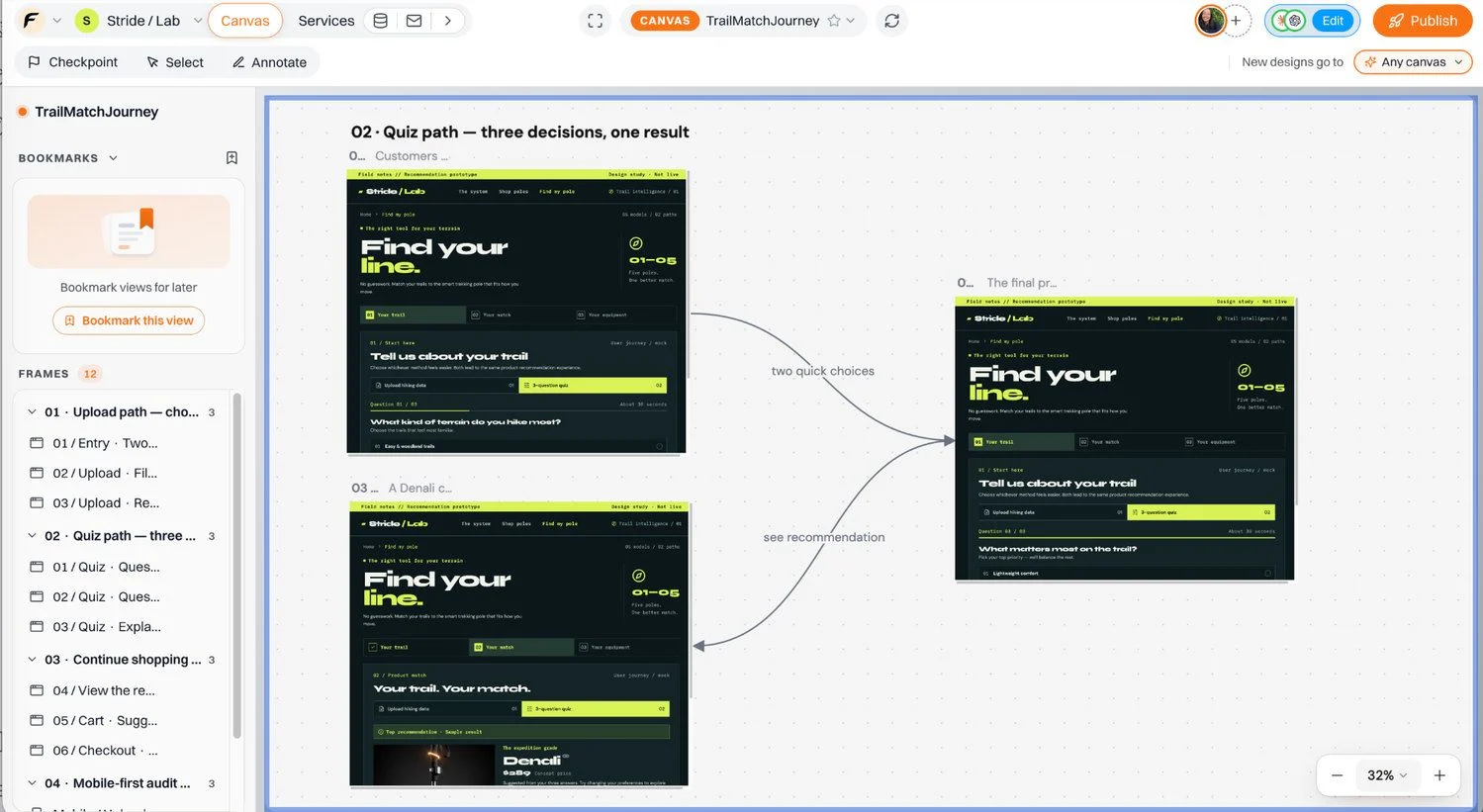
Figure 16 The second route is a low-friction alternative.
Initially, Matthew has a clear goal: he wants to help customers find the trekking pole that best suits their needs. To explore how this could work, he asks his assistant to create a customer journey in Floot Design Canvas with two tabs: one for uploading hiking activity data and another for completing a quick three-question quiz.
Following Matthew's instructions, the assistant creates both journeys on Canvas, allowing him to compare the two approaches visually before implementation. Both paths lead to personalised product recommendations, helping customers make more informed purchasing decisions with less effort.
Both paths should converge on a common result. The match explains why a model fits and offers clear actions to view the product or add it to the cart. The customer should not have to restart their shopping journey after receiving help.
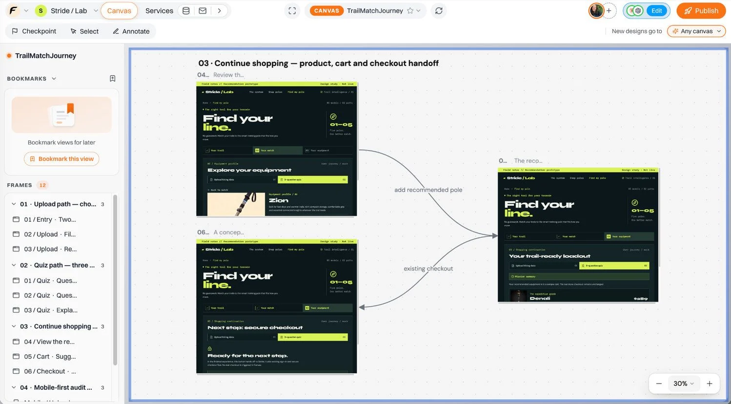
Figure 17 The journey carries the user from a personalised recommendation back into normal shopping.
Matthew also wants to make sure the recommendation journey works well on smaller screens. In his original prompt, he explicitly asks his assistant to design for both desktop and mobile, recognising that crowded tabs, small text and long headings can make mobile interfaces difficult to navigate.
Following these instructions, the assistant creates mobile layout variations on Floot Design Canvas. Matthew can then review how the upload and quiz journeys adapt to smaller screens, compare the layouts and identify potential usability improvements before implementing the feature.
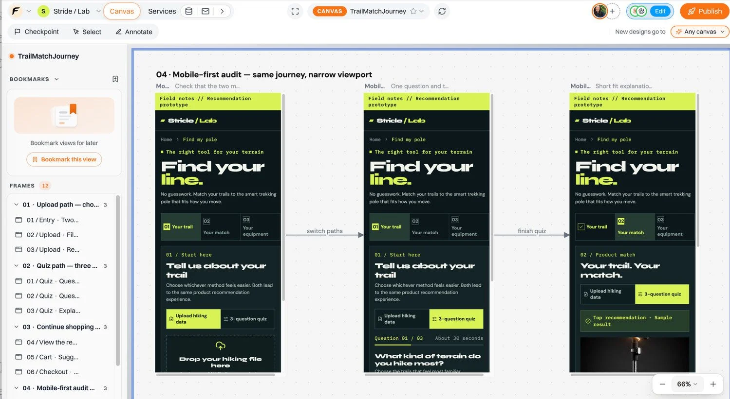
Figure 18 Mobile layout variations created by the assistant in Design Canvas, showing the upload and quiz journeys alongside the shared recommendation outcome.
10. Refine the journey directly on the Canvas
Matthew doesn't accept the first layout uncritically. Some of the display type is too stylised and difficult to scan, so he decides to refine the heading without changing the rest of the customer journey.
To select the heading, double-click the design frame or switch the canvas to Interact mode. Then turn on Select in the preview toolbar and click the heading he wants to improve. When using ChatGPT or Claude, Matthew pastes the copied selection into his conversation with the assistant and asks for a more readable treatment.
This allows him to make a targeted typography change while keeping the layout, inputs, labels, colours and interactions unchanged.
Ask your assistant:
Make this heading easier to read. Use a clear sans-serif, comfortable line height and sensible letter spacing. Keep the rest of this frame unchanged, including the layout, inputs, labels, colours and interactions.
The next two images capture that before-and-after refinement.
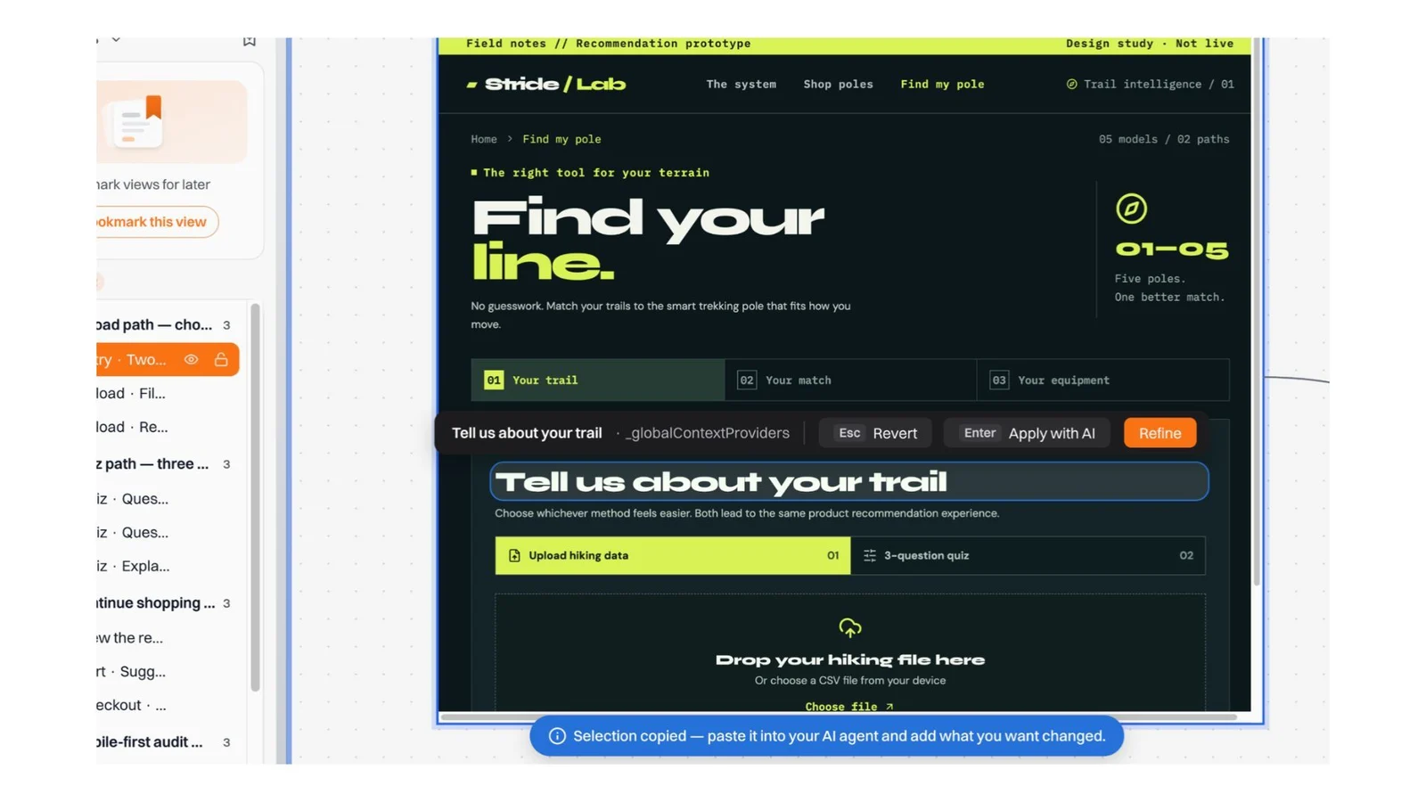
Figure 19 The original prototype heading has a more decorative shape and feels harder to read. The Select tool was used to refine the header, improving its clarity and visual appeal in the Canvas directly.
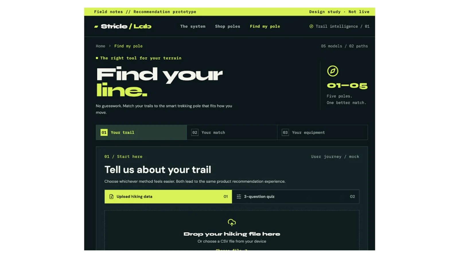
Figure 20 A targeted text change improves readability.
The real strength of Floot Design Canvas can be summed up in one sentence. Explore broadly, choose deliberately, and refine precisely.
11. Implement the design in the existing store
Only after the flow feels coherent does Matthew ask Floot to build it into the store. The key instruction is to add Find my pole to the navigation without altering the three existing items: The system, Shop poles and Technology.
Ask your assistant:
Implement the Find my pole journey from the new Design Canvas in my existing Stride / Lab store. Add Find my pole as a fourth navigation item. Do not change the existing The system, Shop poles or Technology items.

Build both the CSV upload and three-question quiz paths.

Use our five existing products for recommendations, explain why each match makes sense, and connect the result to the real product details, cart and existing checkout. Keep the visual style and readability rules from the Canvas.
The result is a real page in the store. Customers can choose between the two methods. In the current implementation, a CSV is parsed locally in the browser; quiz answers and extracted hiking characteristics are used to rank the existing products. The result can send a customer to a product page or add an item to the cart.
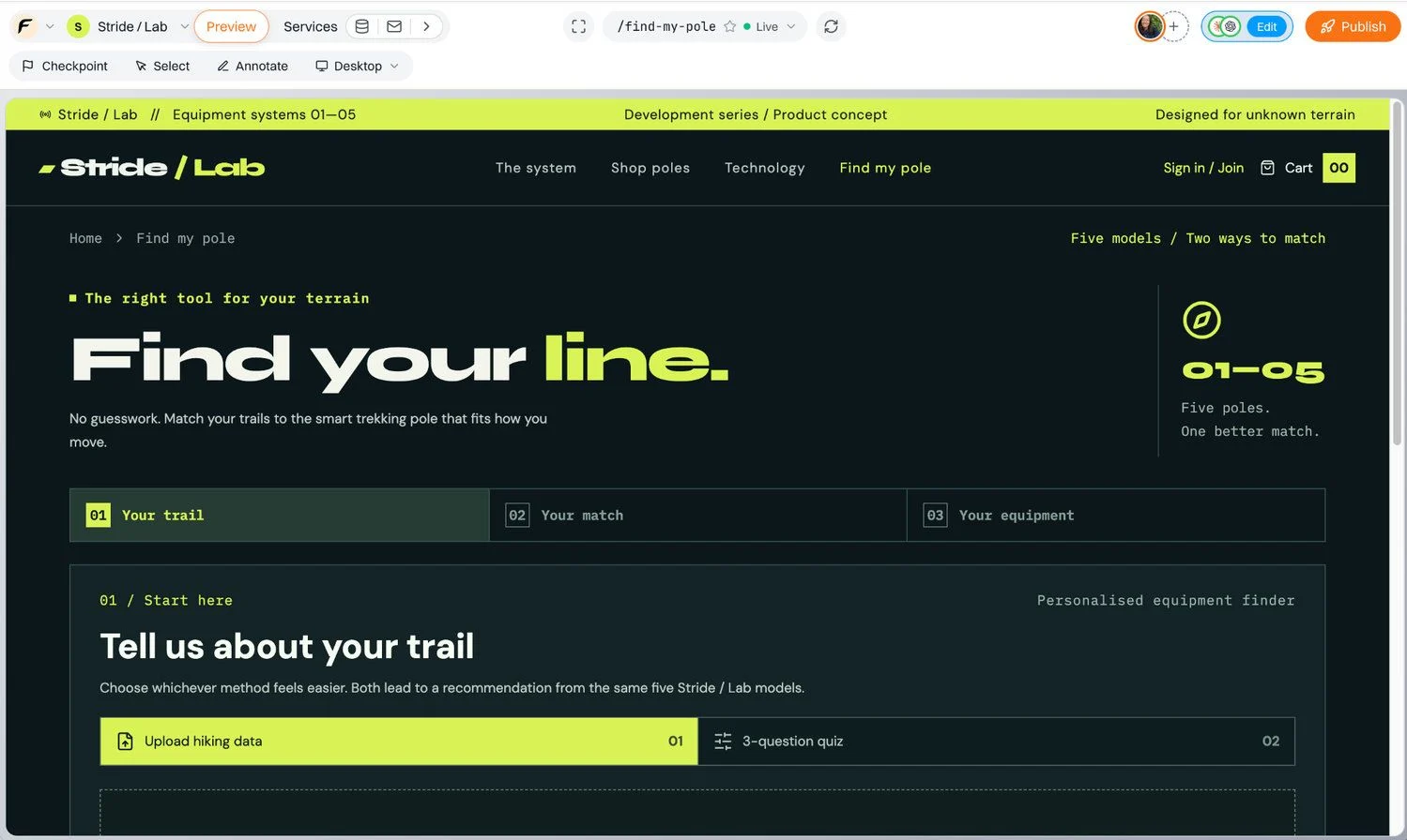
Figure 21 Find my pole is now a visible navigation destination, and the two-tab journey has moved from Canvas into the application.
12. Explore future database enhancements for product recommendations
As Matthew adds the Find my pole feature, his store begins using customers' hiking preferences to recommend suitable trekking poles.
The current recommendation system works with information already available in the products database, including product categories, weights, battery life and features. It compares these existing product attributes with customers' quiz answers or hiking data to rank the five trekking pole models. No database schema changes are required for this initial functionality.
However, Matthew also wants to explore how the recommendation system could become more sophisticated in the future. For example, the store could explicitly record which terrains and hiking durations each model is designed for, rather than relying entirely on existing product characteristics.
The existing products table contains 17 columns. As a potential enhancement, Matthew explores adding three more columns to support more detailed product matching:
suitable_terrains: Records which types of terrain each trekking pole is best suited for.suitable_hike_durations: Specifies the hiking durations each model is designed to support.key_strengths: Highlights each model's main advantages to help explain why it is recommended.
If implemented, these three additional columns would expand the products table from 17 to 20 columns, allowing the recommendation system to use more explicit suitability information when comparing products. This is a proposed enhancement rather than a change already applied to the database.
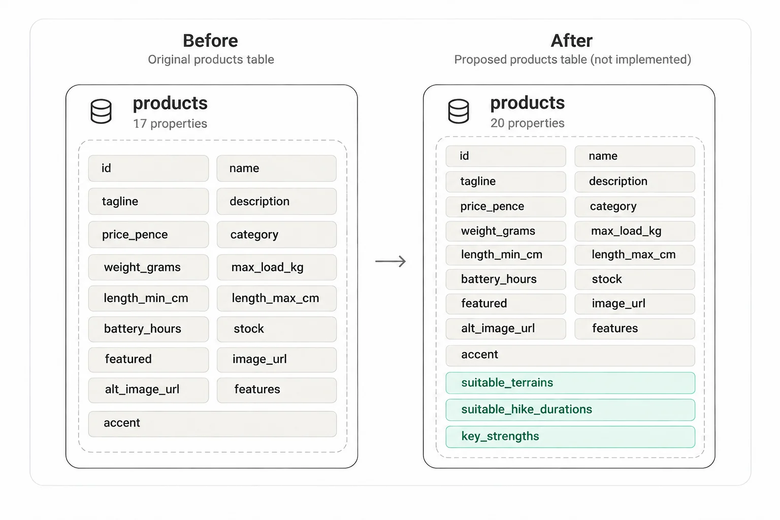
Figure 22 Comparison of the existing products table with 17 columns and a proposed version with 20 columns, including three new recommendation fields: suitable_terrains, suitable_hike_durations and key_strengths. These additions are proposed for future improvements to product matching and have not been implemented in the current database.
Matthew also considers a future saved_recommendations table that would connect signed-in customers with their recommended products. This optional feature would allow customers to save their matches and revisit them later without repeating the questionnaire. The table is shown here as a proposed database design and has not been created in the current application.
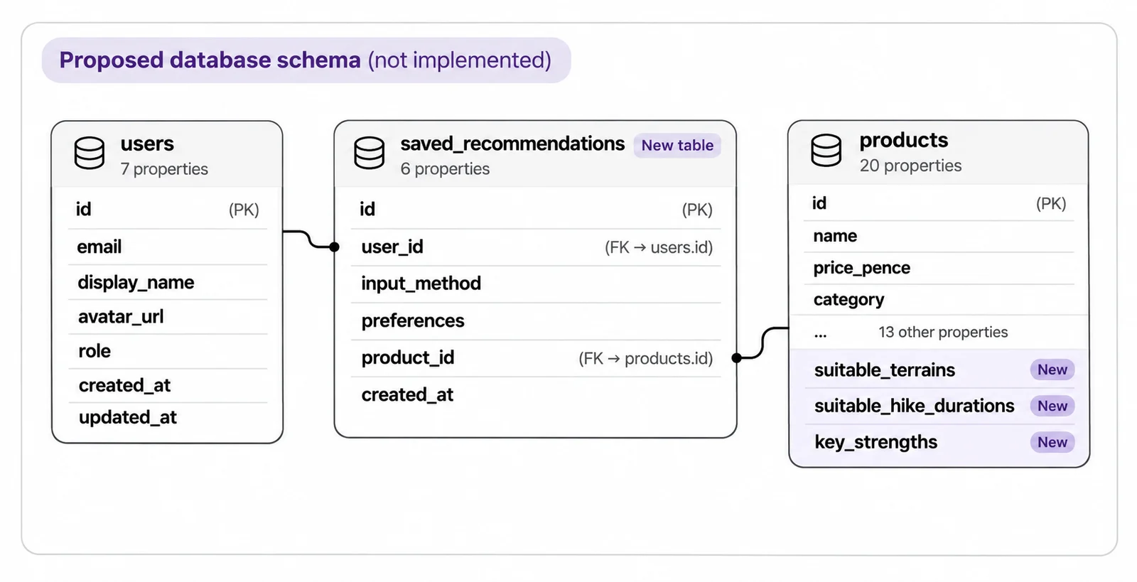
Figure 23 Proposed database relationship showing how a future saved_recommendations table could connect users with recommended products. This table has not been implemented.
Floot allows Matthew to develop the application interface and database within the same workflow. When a future feature requires changes to the database, his assistant can prepare the necessary SQL changes for Matthew to review and approve before they are applied.
It is important to distinguish proposed schema changes from changes that have actually been executed. In the current Stride / Lab implementation, the recommendation feature uses existing product data. The three additional product columns and saved_recommendations table remain possible future enhancements.
Database changes also require extra care once a store is live. Floot's preview and published application share the same database, meaning that approved schema changes can affect live customers immediately, even before new application code is published.
Before experimenting with a live store's database structure, Matthew should duplicate the app to create a separate testing environment. Duplicating an app requires a paid Floot plan.
In Floot, open Duplicate > Database Options and choose Duplicate with full data to create a separate database containing copies of the existing products and other records (how to duplicate a project). Alternatively, choose Duplicate schema only to create a separate database with the same table structure but empty tables.
Avoid the default Share database option when testing schema changes, as this would connect the duplicated app to the original database, potentially affecting live customers. Choosing a separate database allows Matthew to explore and test future enhancements without changing the live store's data or structure.
As his store grows, Matthew can use Floot to prepare, review and implement future database enhancements when new functionality genuinely requires them.
13. Review customer upload edge cases in Examples
Uploading customer data adds a different kind of complexity. A customer might choose an unsupported file type, an empty CSV, data with missing columns, or a file with invalid numbers. A polished happy-path cannot show whether the experience handles those situations helpfully.
Instead of focusing on product loading states, Matthew uses Floot Examples on the Find my pole page to explore the customer upload journey. This helps him uncover potential edge cases he might otherwise overlook, such as invalid files, missing data or failed uploads, and make sure customers receive clear, helpful feedback when something goes wrong.
Ask your assistant:
Create Examples for the Find my pole page to explore how different CSV upload states and server responses are presented.

Show the following states: Ready to upload; Reading and processing the CSV file; Successful upload with a hiking data preview; Multiple hiking activities; Wrong file type or file too large; Missing columns, invalid values or unsupported terrain; and Empty or unreadable file.

For each state, show the appropriate loading indicator, success message or helpful error message so customers know what to do next.

Make each staged state accessible in the editor, for example through a page address or component Example. Do not assume that selecting a file or running the local CSV parser automatically creates a separate page Example.

Keep the existing page design and real browser-side CSV parsing functionality unchanged. Use Examples to review how different states look and communicate information, rather than to verify the actual upload process.
Matthew can now inspect different upload states without having to reproduce every error manually. These include loading indicators, successful previews and helpful error messages.
Examples stage what the server returns, so Matthew can review each state's design and wording. However, the page still runs its real browser-side code, meaning that selecting a file may trigger the local CSV parser. These locally generated states do not automatically become separate page Examples unless the assistant makes them accessible.
Examples are not a test of the actual upload process. Matthew must check CSV parsing, file validation and error handling separately in the working application using real sample files.
Examples stage what the server returns, but the page's real browser-side code can still run, so selecting a file may trigger local CSV parsing. These locally generated results do not automatically become separate Examples unless the assistant makes them accessible. Reviewing Examples does not verify actual upload functionality, so Matthew must test CSV parsing, file validation and error handling separately in the working application using real sample files.
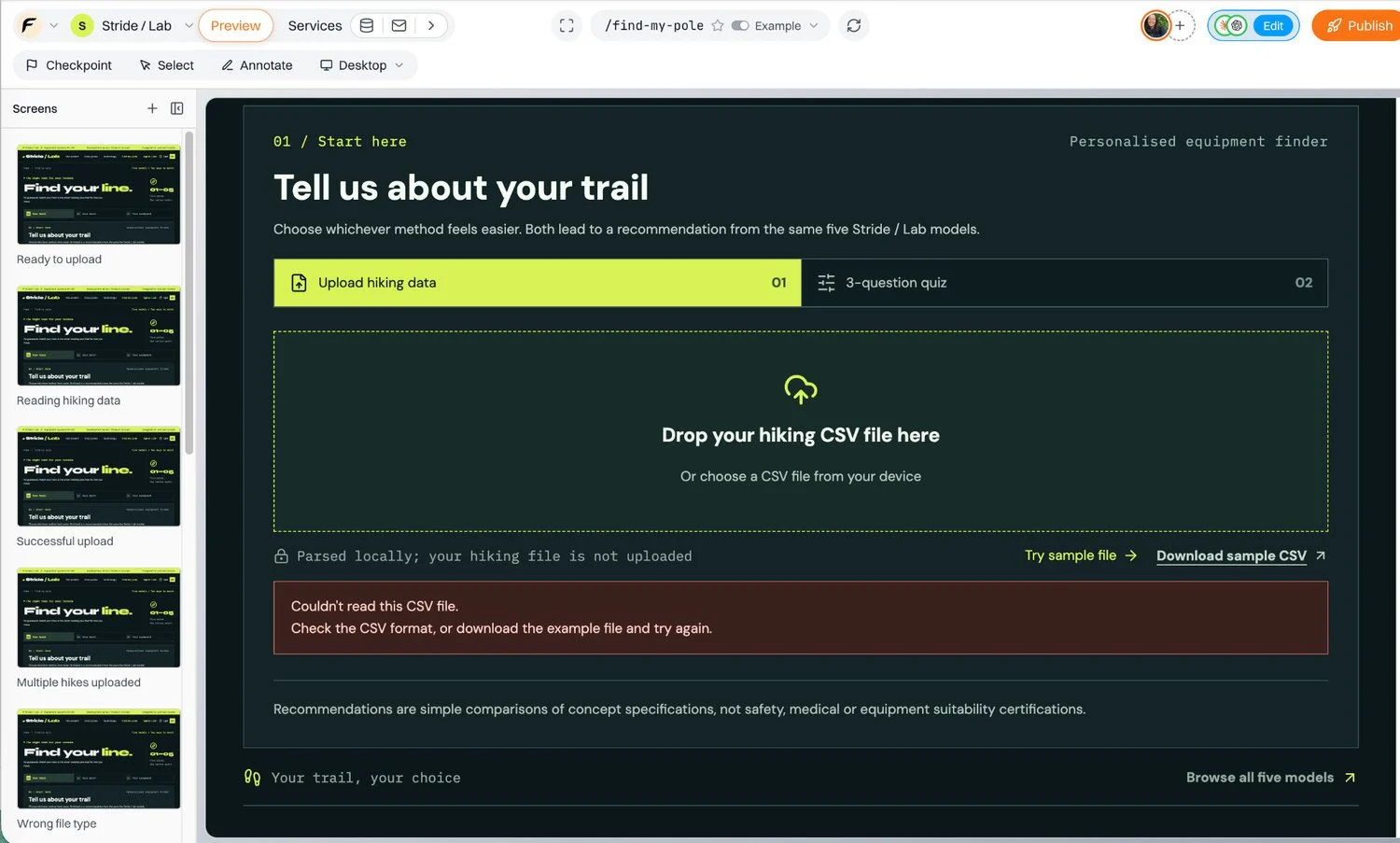
Figure 24 Staged upload success and error states in Floot Examples, used to review UI feedback rather than verify actual CSV processing.
The final walkthrough: one customer, two routes, one working store
To close the tutorial, Matthew can review the complete customer journey through two separate checks: testing the working application and inspecting staged UI states in Floot Examples.
Part 1: Test the real application
- Open the published Stride / Lab store and navigate to Find my pole.
- Select Upload hiking data, upload a sample CSV file and confirm that the application correctly parses and displays the hiking information.
- Generate a product recommendation, review its explanation and open the recommended product's detail page.
- Return to Find my pole and complete the three-question quiz to check the alternative recommendation path.
- Add a recommended trekking pole to the shopping cart in the published store and confirm that the cart updates correctly. Then return to the Floot editor preview, where Stripe operates in test mode. Add the product to the preview cart if needed, and proceed through the existing sign-in and checkout journey using a simulated test transaction. No real payment is taken during this preview checkout.
These steps test actual application behaviour rather than staged Examples. They should only be described as successfully completed after Matthew has performed and verified them.
Part 2: Review error states in Floot Examples
- After completing the real-app walkthrough, return to the Floot editor and open the Find my pole page. Switch from Live to Example mode, then open an invalid CSV upload state that the assistant has made accessible, for example through a page address or component Example.
Review how the interface displays the error message and guides the customer towards correcting the problem.
Examples stage what the server returns, allowing Matthew to review each state's design and wording. They are available within the editor and are not part of the published store.
The page's real browser-side code can still run in this environment, so selecting a file may trigger local CSV parsing. However, those results do not automatically create separate page Examples.
Reviewing a staged error state does not verify that the real application correctly detects or rejects invalid files. To test actual error handling, Matthew must separately upload invalid CSV files in the working application and confirm that the appropriate error messages appear.
Floot can also help turn a web application into a native iOS or Android app. Matthew's Stride / Lab store is a good example of a shopping experience that could be extended to mobile, allowing customers to explore products, find their ideal trekking pole and shop directly from their phones.
To publish a native mobile app, the store owner needs their own developer account, such as an Apple Developer Program membership for iOS or a Google Play developer account for Android, along with sufficient mobile build allowance under their Floot plan. Publishing through Google Play also requires a paid Floot plan.
The owner can initiate a mobile build from Floot's Publish screen by enabling Publish mobile app. After connecting a developer account, Floot can help build and upload the app to the relevant store's testing environment. Final public release remains subject to the app store's review and publishing requirements.
What readers should take away
Matthew did not begin with a perfect specification. He began with a product idea and kept refining it:
- Design Canvas helped him see six different visual directions and choose one.
- A second Canvas let him compare different typography treatments while maintaining a consistent overall visual design.
- Select made small readability and layout fixes precise.
- Examples helped him evaluate image loading and visitor states.
- A new journey Canvas turned feedback into two ways to find the right pole.
- Implementation connected that journey to existing products, the cart and checkout.
- More Examples made customer-upload failure cases visible for design review.
Throughout Matthew's journey, Floot Design Canvas helps him explore different ideas, compare visual directions, refine typography and design a smoother customer experience before committing to implementation.
Floot simplifies this process by allowing Matthew to manage the frontend and backend within a single development environment, rather than treating them as two separate projects.
Matthew can move from exploring designs in Canvas to building a functional application, connecting the frontend with the backend and database, using Floot Examples to inspect staged interface states, and testing actual functionality separately in the working application. As his product becomes more complex, Floot can also help him plan, review and implement database changes when future features genuinely require them.
Design it in Canvas. Refine it with Select. Build it into the store. Review states with Examples. Test functionality in the app. Keep improving it, all within the Floot ecosystem.
Xian Li
Xian Li is a first-time founder building in public and the writer of In Silico, In Soul, a newsletter about the mistakes, lessons and breakthroughs that come with creating a product from scratch.